This page presents the various projects and experiences completed over time.
In this section, you will find an overview of the experiences that have shaped my professional and personal journey. Each experience is described with its objectives, the challenges faced, and the results achieved.
These experiences have allowed me to develop a wide range of skills and gain valuable expertise in my field. Feel free to contact me for more information or to discuss future collaborations.
1 - Automation Strategy for System Test Analysis Methods, MBDA
Technical internship carried out between 03/04/2023 and 19/05/2023 in Le Plessis-Robinson.
The information related to this internship is subject to a confidentiality policy. Some information may not be disclosed.
About MBDA
MBDA is a leading company in the defense sector, specializing in the design and production of missile systems. With a global presence, MBDA develops innovative solutions to meet the complex needs of its clients. The company is recognized for its technical expertise and commitment to innovation in the defense sector.
During this internship, I worked on the development of an API aimed at industrializing and automating tests on test benches. The goal was to replicate the functionalities of an internal proprietary Java application using Python. Unfortunately, the internship was cut short due to a security clearance issue.
Achievements
The Python API for automation had already been developed. My role was to use it and explore its possibilities.
I tested and used the API to automate certain test procedures, which helped reduce manual interventions and increase process efficiency.
In parallel, I took charge of the internal proprietary application and developed several test modules in Java for it.
I also developed plugins on Netbeans with Java for the analysis software.
2 - Prototyping a demo Web Application for ML Models, Technilog
Technical internship carried out between 22/05/2023 and 01/09/2023 in Saint-Rémy-lès-Chevreuse.
About Technilog
Technilog is a service company specializing in the development of software solutions for the integration of connected industrial objects or IIOT (“Industrial Internet of Things”). Technilog offers two flagship software solutions: Dev I/O, a remote management and supervision software that unifies and processes data from connected equipment, and Web I/O, a platform for the supervision and control of connected objects across various platforms.
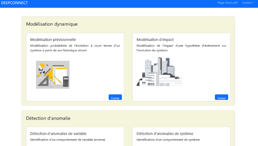
As part of the evolution of IoT solutions offered by Technilog, a new version of their flagship product, Web I/O, has been developed. This version integrates advanced features, including artificial intelligence (AI) tools. To illustrate these tools, a web application was created to demonstrate the use cases and capabilities of this new version.
Achievements
An initial version of this demonstration site was developed by the previous intern. In this version, data qualification functionalities and variable anomaly detection were implemented. Additionally, the necessary infrastructure for web hosting of the application was set up. My role was to add new features and participate in the design meetings for the web pages:
Anomaly Detection: Based on machine learning from historical data, this feature determines if a value behaves unusually.
Forecast Simulation: Similar to anomaly detection, this feature uses machine learning from historical data. From this learning and previously obtained values, a model can be determined to anticipate future values.
Impact Study: Allows evaluating the impact that different variables have on each other, as well as the relationships between these variables, providing an in-depth understanding of the mutual influences of these components.
Quality of Life Improvements: Addition of authentication features and model updates.
Deepening Knowledge: In-depth study of various artificial intelligence models.
2.1 - Implementation of the Web Application
In this section, we will explore the technical aspects of the web application. The development framework is “Dash”, a Python framework for creating web applications.
Introduction to Dash
Dash is a Python framework for creating interactive web applications. It operates with layouts and callbacks. In our implementation, we also use the Plotly library for data visualization and graphs.
The framework operates with layouts and callbacks, these components define the appearance and functionality of the application.
Layouts
Layouts define the appearance of the application. They consist of standard HTML elements or interactive components from specific modules. A layout is structured as a hierarchical tree of components, allowing for the nesting of elements.
Dash is declarative, meaning that all components have arguments that describe them. The arguments can vary depending on the type of component. The main types are HTML components (dash.html) and Dash components (dash.dcc).
The available HTML components include all standard HTML elements, with attributes such as style, class, id, etc. Dash components generate high-level elements such as graphs and selectors.
Callbacks
Callbacks are functions automatically called when an input component (input) changes. They display the result of the functions to an output component (output).
Callbacks use the @callback decorator to specify the inputs and outputs, corresponding to the id of the components and the properties to be updated. Each attribute of a component can be modified as an output of a callback, in response to an interaction with an input component. Some components, like sliders or dropdowns, are already interactive and can be used directly as inputs.
Example Code
Here is an example of code illustrating the use of Dash and Plotly:
Documentation
fromdashimportDash,html,dcc,callback,Output,Inputimportplotly.expressaspximportpandasaspd# Loading datadf=pd.read_csv('https://raw.githubusercontent.com/plotly/datasets/master/gapminder_unfiltered.csv')# Initializing the Dash applicationapp=Dash()# Defining the application layoutapp.layout=html.Div([html.H1(children='Title of Dash App',style={'textAlign':'center'}),dcc.Dropdown(df.country.unique(),'Canada',id='dropdown-selection'),dcc.Graph(id='graph-content')])# Defining the callback to update the graph@callback(Output('graph-content','figure'),Input('dropdown-selection','value'))defupdate_graph(value):# Filtering data based on the country selectiondff=df[df.country==value]# Creating a line graph with Plotly Expressreturnpx.line(dff,x='year',y='pop')# Running the applicationif__name__=='__main__':app.run(debug=True)
2.2 - Models used
In this section, we will explore the technical aspects of the models used in the project. Although I do not personally participate in their development
The Machine Learning and Deep Learning models used for the implemented features include time series forecasting models and autoencoder models.
Time series forecasting models allow for predicting future values over a given period. They are developed from historical data to predict future values.
A time series is a set of data points ordered in time, such as temperature measurements taken every hour during a day.
The predicted values are based on the analysis of past values and trends, assuming that future trends will be similar to historical trends. It is therefore crucial to examine trends in historical data.
The models make predictions based on a window of consecutive samples. The main features of the input windows include the number of hourly points and their labels, as well as the time offset between them. For example, to predict the next 24 hours, one can use 24 hours of historical data (24 points for windows with an hourly interval).
Autoencoder models are neural networks designed to copy their input to their output. They first encode the input data into a lower-dimensional latent representation, then decode this representation to reconstruct the data. This process allows for compressing the data while minimizing the reconstruction error.
In our case, these models are trained to detect anomalies in the data. Trained on normal cases, they exhibit a higher reconstruction error when faced with abnormal data. To detect anomalies, it is sufficient to set a reconstruction error threshold.
Conclusions
These models play a crucial role in the project by enabling accurate predictions and anomaly detection. Although I did not directly participate in their development, this internship offered me a valuable opportunity to deepen my knowledge of machine learning and understand the importance of these models in real-world applications. These tools not only help anticipate future trends but also identify unusual behaviors, contributing to more informed and proactive decision-making, which is relevant for IoT.
2.3 - Work Completed
We will explore the achievements made during this internship and the various features that were implemented.
We will explore the achievements made during this internship and the various features that were implemented.
Achievements
As indicated on the summary page, an initial version of the site had already been implemented by the previous intern. In this version, the data qualification and variable anomaly detection features were put in place. Additionally, the infrastructure necessary for web hosting of the application was installed. This infrastructure is hosted on OVHCloud, using an Ubuntu 22.04 distribution, and the application is deployed with Flask.
For this internship, the missing features will need to be implemented, including forecast simulation, systemic anomaly detection, and impact study. Additionally, quality of life (QOL) improvements will be made.
2.3.1 - Forecast Simulation
We will explore the developments made for the “Forecast Simulation” section.
The implementation of the forecasting feature was done in the same manner as the other functionalities: creating the layout, defining the callbacks, and setting up the associated container. This approach was applied to all new features.
This feature aims to present the different models available for predicting variables such as temperature, pressure, power, etc. The models are trained on data from Technilog sensors, clients, or artificial sources. The feature includes two tabs:
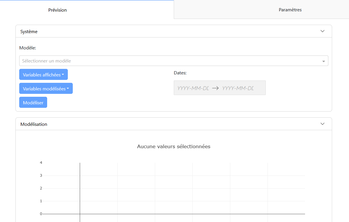
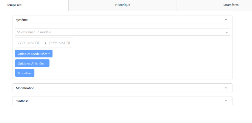
Forecast Tab: This tab contains the configuration panel “System” and the modeling panel “Modeling.”
Configuration Panel: Allows for selecting the modeling parameters, such as the model, input variables, variables to display, variables to model, and the study period. Once the variables are selected, it is possible to perform the prediction and visualize the modeling.
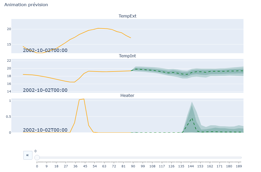
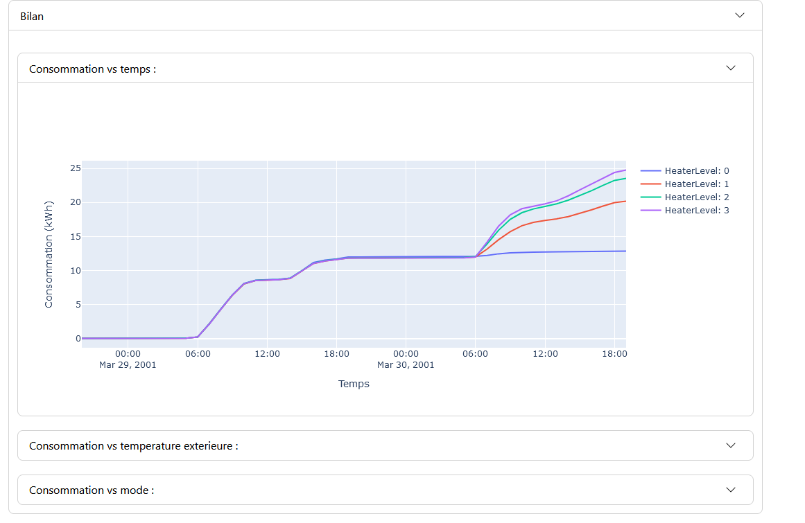
Modeling Panel: Displays the modeling graphs for each variable. The graphs show the actual data in orange and the predictions with uncertainty in green. Control buttons allow managing the animation, if this option is enabled.
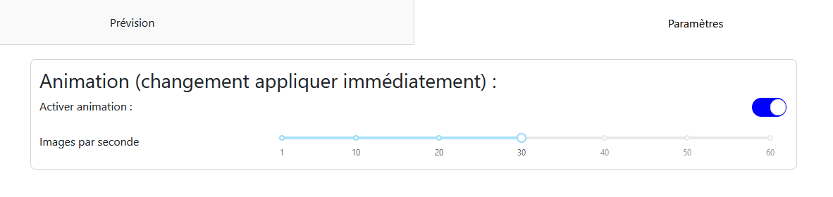
Settings Tab: Contains the parameters for the modeling animation, such as enabling the animation and the number of frames per second. These options are saved and applied to all models in the feature.
2.3.2 - System Anomaly Detection
This feature allows for the detection of anomalies in real-time and historical data.
For system anomaly detection, three tabs are available: “Real-time,” “Historical,” and “Settings.” The “Real-time” and “Historical” tabs correspond to different use cases of the feature.
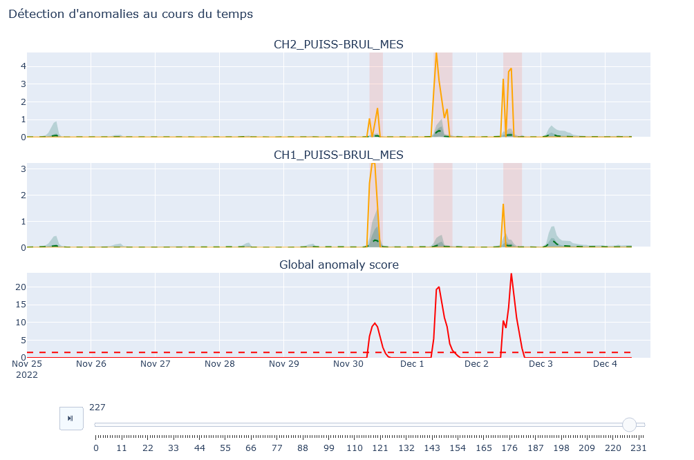
“Real-time” Tab
In the “Real-time” tab, you will find the configuration panels “System,” modeling “Modeling,” and summary “Summary.”
Configuration Panel: Allows you to select the model, modeled variables (variables monitored to determine anomalies), displayed variables (variables visible in the modeling panel), and the measurement period (start and end dates). Default values exist depending on the selected model.
Modeling Panel: Displays graphs of the selected values with their models. If the anomaly threshold is enabled in the “Settings” tab, a graph of the anomaly score is also displayed, highlighting areas where the score exceeds the threshold.
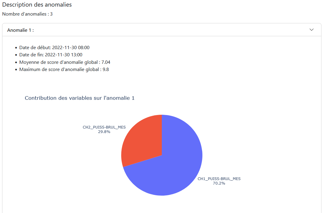
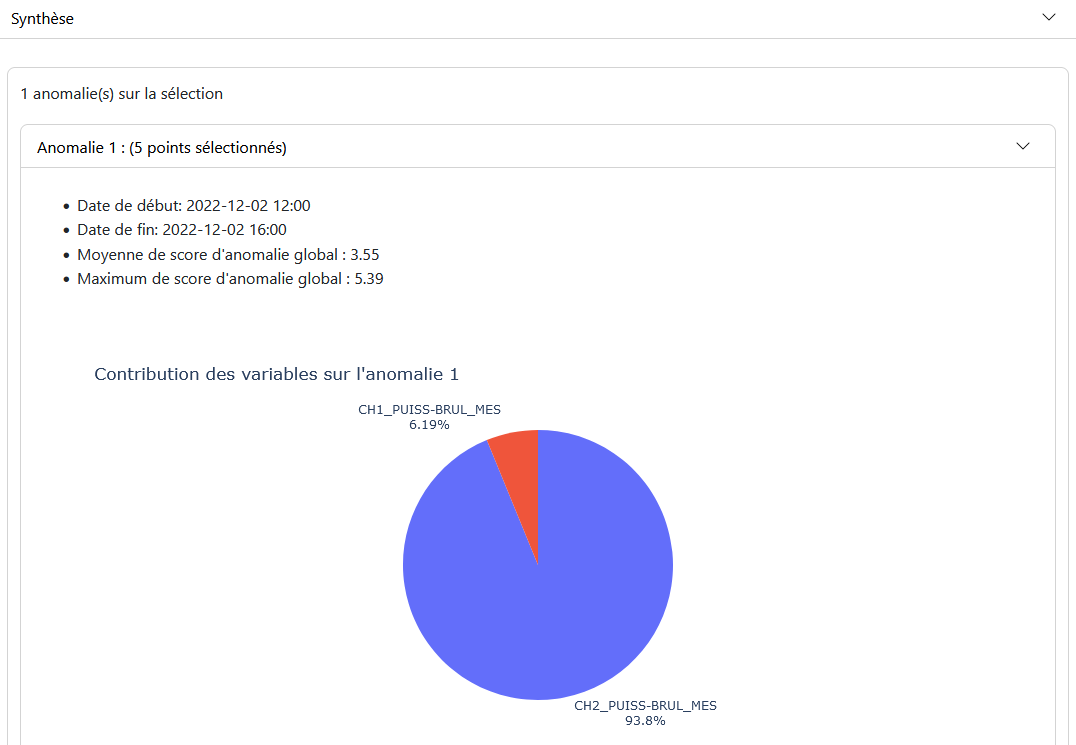
Summary Panel: Provides a description of the anomalies over the given period and the contribution of the modeled variables to these anomalies.
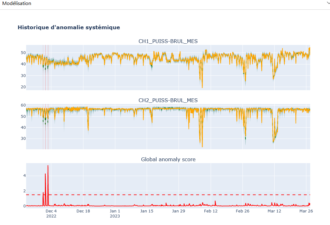
“Historical” Tab
In the “Historical” tab, you will also find the configuration panels “System,” modeling “Modeling,” and summary “Summary.”
Configuration Panel: Similar to the “Real-time” tab with the same choices. Allows you to choose the model, modeled variables, and displayed variables. Unlike the “Real-time” mode, there is no period selection, as the analysis covers the entire period of available data.
Modeling Panel: Displays results based on the selected parameters. The user can select a specific period by clicking and holding on the obtained model.
Summary Panel: Displays the results of anomalies for the selected period, with descriptions of the anomalies and the contribution of the modeled variables.
“Settings” Tab
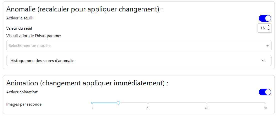
Anomaly: Allows you to enable the anomaly threshold and set its value. A histogram of anomaly scores helps determine the optimal threshold value.
Animation: Allows you to enable or disable the animation and choose the number of frames per second.
2.3.3 - Impact Study
This feature allows for analyzing the impact of variables and their mutual influences.
This feature allows for visualizing the impact of a variable, that is, the influences of variables on each other. It thus enables observing the consequences of modifying one or more variables on the others.
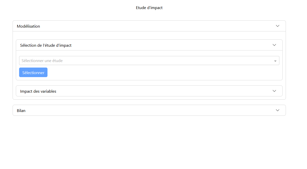
The interface consists solely of the “Impact Study” tab with the “Modeling” and “Summary” panels. In the “Modeling” panel, you will find the sub-panels “Impact Study Selection” and “Variable Impact.”
Selection Panel
In the selection panel, the user chooses the desired impact study. Once the study is selected, the modeling is displayed in the modeling panel.
Modeling Panel
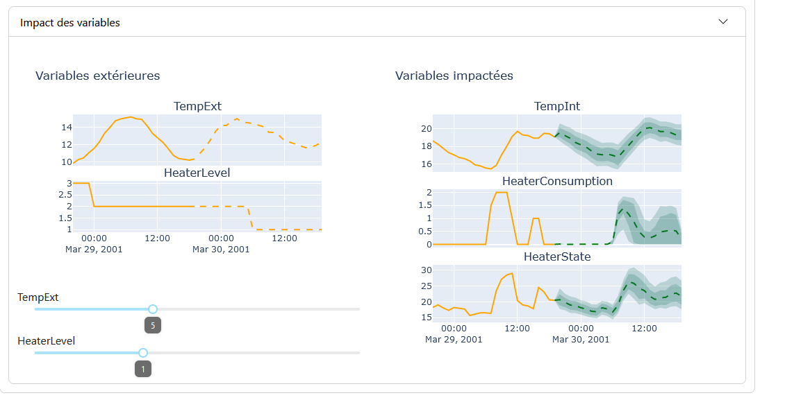
The modeling of the impact study is presented in two parts:
External Variables: These are the hypothesis variables that influence the impacted variables. They are adjusted via sliders.
Impacted Variables: These are the variables that change based on the external/hypothesis variables.
With each modification of the values of the external variables, the graphs of the impacted variables are regenerated. The modeling graphs are similar to those of the “Forecast Modeling” feature, with a few differences: for the graphs of the hypothesis variables, the part of the graph with prediction and uncertainty is replaced by a section representing the values set by the sliders.
Summary Panel
In the summary panel, different graphs are displayed depending on the chosen study. These graphs highlight the links and impacts between the variables. When the slider values are modified, the results of the graphs change accordingly.
Comparison with Other Features
Unlike other features, there are fewer options available (no selection choices for date/period or variables). In the context of a demo web app, these choices are determined by the study’s parameter file.
2.3.4 - Update, QOL ("Qualities Of Life")
This feature allows for adding and updating available models, configuration files, datasets, and default value files.
Update
The update feature allows for adding and updating available models, configuration files, datasets, and default value files.
Tabs
There are three main tabs:
Models: Allows for updating, adding, and deleting models, as well as impact studies.
Datasets: Allows for updating, adding, and deleting datasets.
Preconfiguration: Allows for modifying the default values of models for their applications.
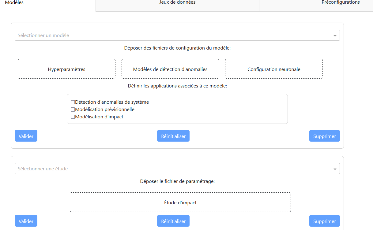
“Models” Tab
Main Panel:
A dropdown menu to select the model.
An area to drop the necessary files (model, hyperparameters, neural configuration).
A checklist to select the applications associated with the model.
Three buttons: validation, reset, and deletion.
Updating a Model:
Select the model to update from the dropdown menu.
Drop the new configuration files.
Select the associated applications.
Confirm with the “Validate” button.
Adding a Model:
Select “New Model” from the dropdown menu.
Drop the necessary files.
Select the associated applications.
Confirm with the “Validate” button.
Deleting a Model:
Select the model to delete.
Confirm with the “Delete” button.
A dialog box will ask for confirmation.
Impact Study:
A dropdown menu to select the study.
An area to drop the configuration file.
Three buttons: validation, reset, and deletion.
“Datasets” Tab
Configuration Panel:
A dropdown menu to select the dataset.
An area to drop the data file.
Two buttons: validation and deletion.
Modifying/Adding a Dataset:
Select the dataset to modify or “New Dataset.”
Drop the data file.
Confirm with the “Validate” button.
Deleting a Dataset:
Select the dataset to delete.
Confirm with the “Delete” button.
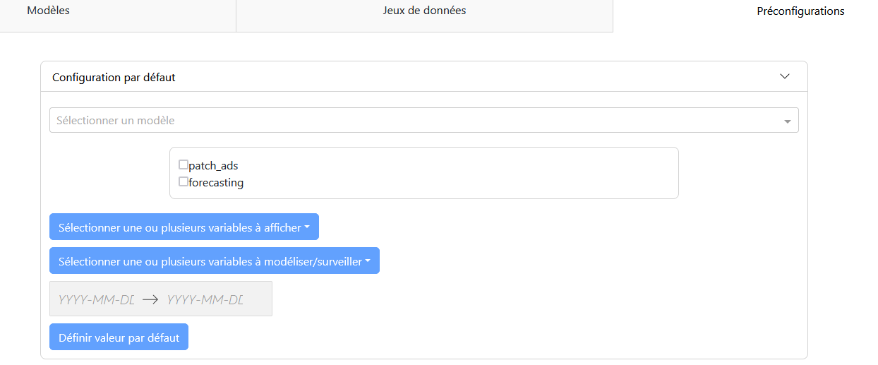
“Preconfiguration” Tab
Configuration Panel:
A dropdown menu to select the model.
A checklist to select the application case.
Selection of variables to display and model.
Selection of the study period.
A validation button “Set Default Value.”
Configuring Default Values:
Select the model and application case.
Configure the modeling parameters (displayed variables, modeled variables, period).
Confirm with the “Set Default Value” button.
File Types
Models:.tpkl files for models and .json files for hyperparameters.
Impact Studies: Python file with configurations for the study.
Datasets:.csv files containing the information used by models for predictions.
Preconfigurations:.json file with values associated with models and the functionality used.
3 - Consultant for Colissimo for the 'Webhook' Project, Artik Consulting
End-of-studies internship carried out between 12/02/2024 and 09/08/2024 in Issy-les-Moulineaux.
About Artik Consulting
Artik Consulting is a consulting firm, founded in 2009, specializing in IT architecture. With over 70 consultants, Artik Consulting supports the IT directors of large public and private companies in their digital transformation projects and the design of architectures that meet new business challenges. Artik Consulting’s main clients include French groups such as La Poste, BNP Paribas, Covéa, Kering, and it also collaborates with start-ups and universities.
I joined Artik Consulting for my end-of-year internship. I first underwent internal training on various technologies, allowing me to acquire a solid foundation. Additionally, I participated in the development of a response to a tender from ESCP.
ESCP wants to implement new visualization and analysis features and facilitate exchanges between the school and its various stakeholders (candidates, students, etc.). The requirements include the use of a star schema database and the Jaspersoft visualization tool.
I was assigned to La Poste Colis (Colissimo) and integrated into Squad 1 to work on an assigned project: Webhook. This project involves implementing a new method for real-time parcel tracking, relying on webhooks to update the progress status of parcels without direct requests to the servers. This solution targets businesses (B2B) with a large volume of parcels to track, thereby reducing their impact on Colissimo’s servers and optimizing their performance. An MVP (“Minimum Viable Product”) of the project has already reduced the number of daily calls from 5.9 million to 1.7 million, a 70% reduction in traffic.
Achievements
During my training through mini-projects, I became proficient in:
Angular, a JavaScript framework for developing dynamic web pages.
Spring, a Java framework for creating backend services like APIs.
Kafka, for real-time data stream processing.
Spark, for analyzing large amounts of data.
Elasticsearch, for indexing and searching data.
Kibana, for visualizing this data.
For drafting the response for ESCP, it was decided to create dashboard examples similar to ESCP’s use case. For this, we took the example of a charitable association with donations, donors, donation pledges, and advertising campaigns. I was in charge of generating this data using the Python library “Faker” and conducting preliminary research on donation differences based on population and country to obtain realistic data. Additionally, I became proficient in Talend tools for transforming the database into a star schema and explored the various possibilities offered by Jaspersoft Studio and Server.
During my mission at La Poste Colis (Colissimo), by joining Squad 1, I was able to observe and participate in the various processes of the Agile Scrum method, project management, and the deployment of projects in different environments in a professional setting.
As part of the industrialization of this project and continuous improvement, I am involved in migrating the project to the Spring Boot framework, particularly through the implementation of API features and message mapping for the various Kafka topics.
3.1 - Internal Training
In this section, we will explore the internal training received during my internship at Artik Consulting.
Technical Foundation
During this internship, I received quick training on various technologies that I could use for my future missions. These technologies offer a broad technical foundation to address different possible tasks.
This foundation is based on:
Angular: An open-source TypeScript framework compatible with JavaScript and maintained by Google, used for web development. It relies on a component-based architecture, where different parts of the user interface (UI) are encapsulated in reusable and independent components. Angular is often used in the development of single-page applications (SPA) or progressive web applications (PWA).
Spring: An open-source Java framework for creating microservices and web applications. It also allows for the development of data processing applications, such as ETL (Extract, Transform, Load) processes, batch processing, and event processing.
Kafka: An open-source distributed streaming platform designed to handle real-time data streams, used for real-time processing, log collection, data pipeline construction, and data integration. Kafka operates on message transactions between producers and consumers, with a partitioned architecture for ordered message storage.
Spark: A powerful framework that allows for the rapid and efficient processing and analysis of vast datasets, seamlessly integrating with Kafka to ensure a continuous and high-performance flow of information.
Elasticsearch: An open-source search and analytics engine that enables real-time searches and analyses with a distributed and scalable architecture, capable of handling enormous volumes of data.
Kibana: A data visualization and exploration tool designed to work with Elasticsearch, allowing the creation of interactive and customizable dashboards that display real-time data visualizations.
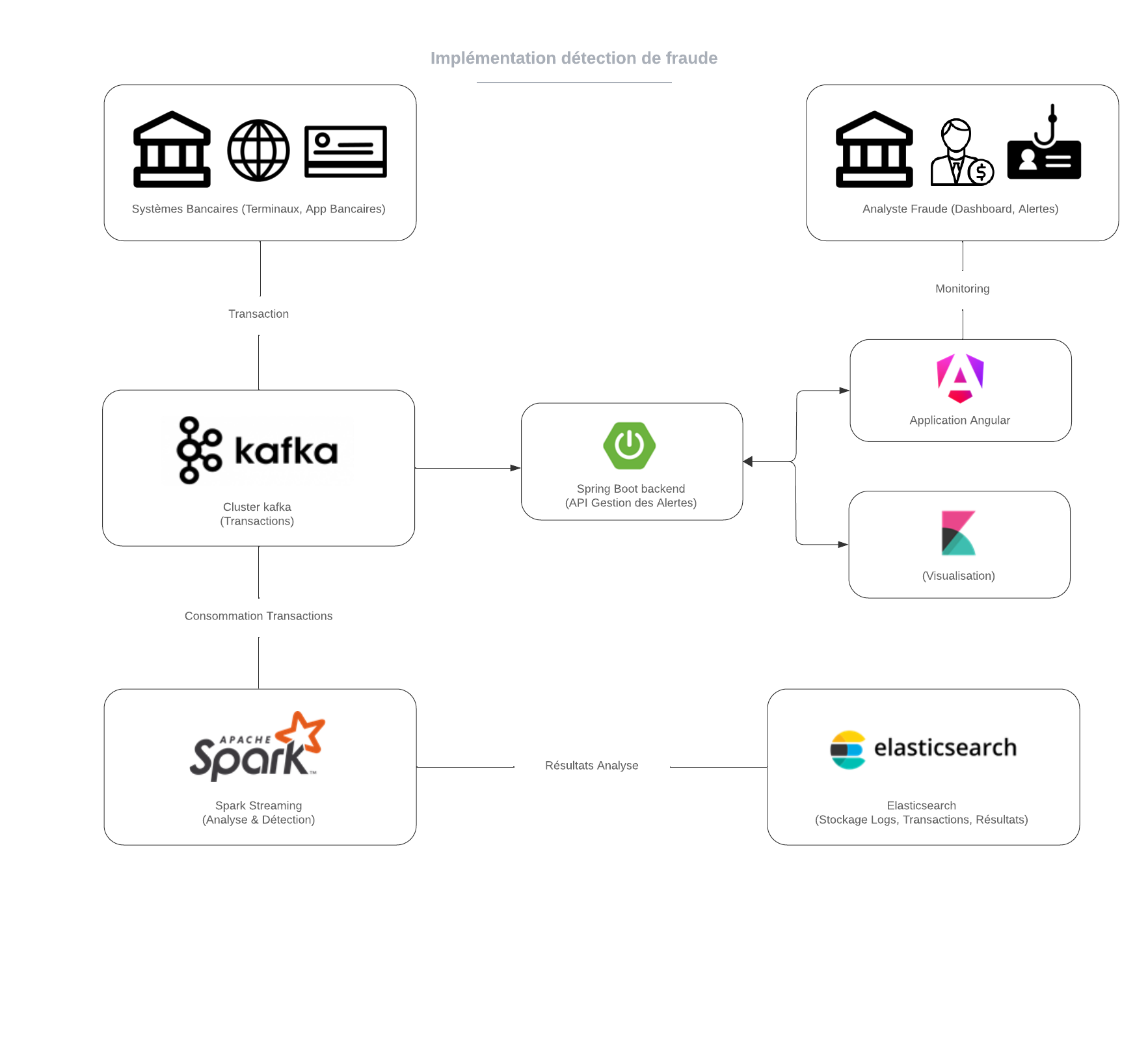
We can summarize these technologies with a concrete example:
In this example, we want to implement a fraud detection and analysis system:
For this, banking transactions are captured via terminals or banking applications and then sent to a Kafka cluster for real-time processing.
The transactions are then consumed by Apache Spark, which performs analyses to detect fraudulent behavior.
The results of these analyses are stored in Elasticsearch, allowing for quick search and visualization via Kibana.
A Spring Boot backend manages the generated alerts, while an Angular application allows analysts to monitor transactions and visualize results through interactive dashboards.
This integrated system ensures effective fraud detection and real-time data analysis.
3.2 - Call for tender, Response Writing ("Tender Response")
In this section, we will explore the details of developing a response to a tender.
During this internship, I had the opportunity to participate in writing a response to a tender from ESCP (“École Supérieure de Commerce de Paris”). ESCP is a prestigious French business school with various campuses and connections in several countries across Europe, giving it significant international influence. It is therefore crucial for the school to have regular and substantial follow-up with this data (applicants, students, professors) through reports or dashboards to assist the school’s administrative staff. ESCP is thus looking for a team capable of setting up a data retrieval infrastructure, performing manipulations with this data, and creating dynamic and relevant reports based on this data.
The team consisted of a consultant and interns, working together to meet the tender requirements and provide a complete and optimized solution.
Project Objective
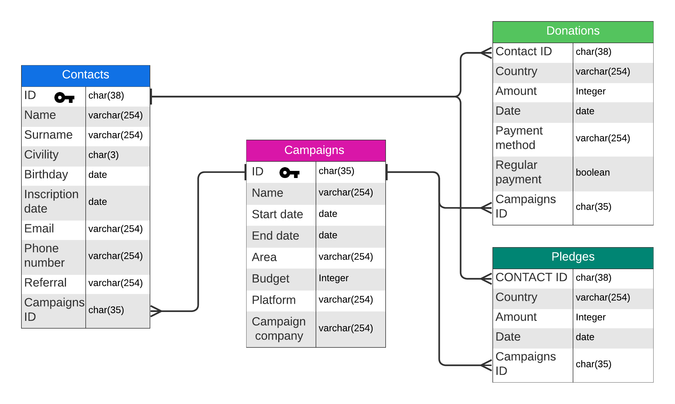
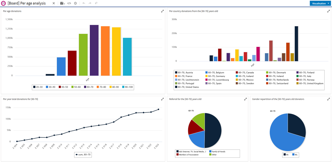
The objective is to create a case similar to that of ESCP to demonstrate the exploitation of databases and graphics in a real-world situation. The chosen example is that of a fictional association with donors, donations, donation pledges, and advertising campaigns to create a scenario similar to the ESCP case. In this context, we generate consistent data to have relevant dashboards and reports; the creation of an infrastructure connecting and manipulating databases; the creation of reports and dashboards with these databases.
Conditions and Tools
The required conditions include the use of Jaspersoft and the implementation of a star schema database (a database modeling approach that facilitates complex queries and analyses by optimizing the data structure for reads, with a central fact table containing information associated with dimension tables providing context).
To transform a relational database into a star schema model, we used the Talend suite. Talend is a data integration tool suite that allows for building robust and efficient data pipelines. We use it for ETL (“Extract, Transform, Load”) tasks to transform the database into a star schema for the Data Warehouse (a centralized repository that stores data from multiple sources, facilitating analysis and information generation).
We feed the PostgreSQL database with previously generated data, via CSV files, and process them to fit a star schema. We will use the result to create reports with Jaspersoft. Jaspersoft offers several solutions: a cloud offer for creating interactive dashboards (“Jaspersoft Cloud”), another offer for hosting a server in the cloud or on a local server (“Jaspersoft Server”), and a software offer for creating reports (“Jaspersoft Studio”).
Personal Contribution
My personal contribution initially involved data generation and exploring the various Jaspersoft solutions. For data generation, I first conducted preliminary research to determine the different criteria that could impact donations and the various hypotheses needed to generate this data. The goal was to have interesting data to model with dashboards and reports, seeking to contrast and highlight exploitable information from the data.
3.3 - Colissimo Mission
In this section, we will explore the details of the mission carried out at Colissimo.
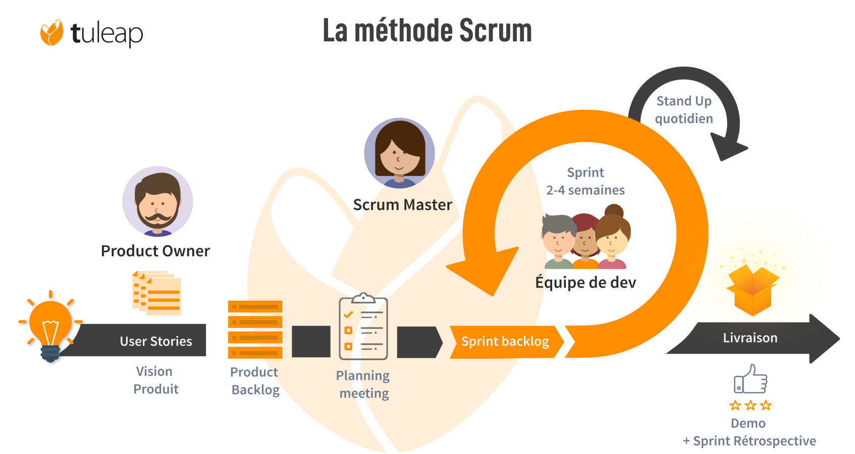
My mission was carried out for La Poste Colis, an important and long-standing client of Artik Consulting. In this mission, I joined Squad 1 for the redesign of the “Webhook” project. However, this is not the only project the Squad is working on. A squad is an agile concept where a small project team, with one or more assigned projects, is autonomous and versatile, with various business roles present.
The Squad works on projects related to Colis 360. Colis 360 is a Colissimo project aimed at centralizing the information that Colissimo receives from third parties working with La Poste Colis. The various third parties have their own methods and message formats. For example, a subcontractor responsible for transporting parcels between sorting centers and delivery centers has a different format from that of the final carrier to the customer. These messages are completely different but have a similar purpose.
With the various messages centralized into a single format where all the information from the different third parties is present, we can then exploit them to ensure better parcel tracking or for third-party applications.
Webhook Project
Initial Context
Before the “Webhook” project was created, there were only two solutions for exposing tracking data to clients:
Electronic Data Interchange (EDI): Processes that allow the exchange of information between the IS of different companies. To make these processes work, standards must be defined between these companies, which can require efforts from IS managers and business experts.
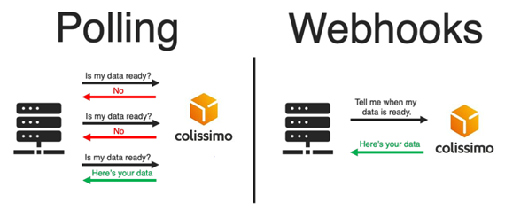
Web Applications: Allowing tracking only with client requests (“Polling”). During real-time tracking, the client sends requests at a certain frequency to ensure an update of the parcel status, which results in unnecessary calls. These solutions offer no possibility for customization.
Offer clients an alternative for real-time tracking.
Provide better customization of tracking based on client needs (filtering by type, etc.).
Decrease contacts with support teams.
This solution targets business clients (B2B) such as Amazon, Alibaba, Temu, and others, companies with high volumes. As the project name indicates, it is based around “webhooks,” an HTTP callback that occurs when an event happens. The client will no longer need to refresh or make calls to see the progress status of the tracked parcels; they are generally used for real-time notifications.
Basic Mechanism
The basic mechanism of webhooks involves making an HTTP request to a specific URL. A webhook makes an HTTP callback to a URL configured by the system to receive data. While APIs and webhooks both accomplish the same task, webhooks are much more efficient for transferring data by significantly reducing server load compared to API calls.
An initial version of the project was estimated to reduce infrastructure costs by reducing the number of daily calls from 5.9 million to 1.7 million, a 70% reduction in traffic.
Redesign of the Webhook Project
Initial Problems
The initial version of the project had some issues:
The project was initially planned for one client as part of an MVP (Minimum Viable Product).
Push errors to one client affected other clients.
It could not handle hundreds of clients in anticipation of future needs; this solution was not scalable.
We wanted to replace the “Akka” framework (Scala/Java) with the Spring framework.
The source code of what I have accomplished cannot be published here, but screenshots can be provided to accompany the explanations.
Achievements
During this internship, I had the opportunity to participate in two projects. The first was drafting the response to the tender, and the second was my mission at Colissimo with the “Webhook” project.
3.4.1 - Contribution to the Tender Response
We will explore the achievements made for the tender response.
Data Generation
Preliminary Exploration for Generation
I gathered information from various French and international associations, directly from their websites or third-party sites like Kaggle. By collecting this information, I was able to determine what was necessary and what was not for our case.
I found the average amount that associations receive for one-time and regular payments. The percentage of donations that are regular and one-time payments, with an average of $100 for a one-time donation and $50 for a regular donation in the United States.
And the different frequently used payment methods such as checks, bank transfers, cash, or credit/debit cards. I noticed a recent change with the democratization of the internet and online purchases. For example, in France, in 2010, 23% of French people donated online compared to 28% in 2020. This trend is present in most age categories but is more pronounced for people under 35, with 28% donating online, an increase of 13% compared to 2010.
Additionally, the average age of donors in the United States is 64 years and in France is 62 years, so it is necessary to show this disparity with the age of donors.
I sought to limit the origin of donations to specific regions; in our case, I chose Europe and North America. These geographic areas are interesting as they have a certain level of similar wealth between the two regions but quite pronounced disparities within these regions, for example, the disparity between the United States and Mexico, and between Western and Eastern Europe. To represent these disparities between countries, I used the GDP per capita of each country and normalized it relative to the United States, meaning that with a GDP per capita of about $76,000, the United States has a value of 1.00, and Mexico with a GDP per capita of about $11,500 has a value of 0.15. These values are used as multipliers for donations from the countries.
The different metrics used are relevant, but I did not consider inequalities within the same country. For this, I used a metric often used in statistics, the Gini coefficient. The Gini coefficient/index is a measure of the distribution and allocation of a value, in our case, wealth. The Gini index ranges from 0 to 1, with a coefficient of 0 corresponding to perfect equality where the distribution of the variable is equal for all, and 1 corresponding to absolute inequality where the distribution of the value is allocated to a single individual. This factor is used to accentuate the maximum and minimum donations. Once this information was gathered, I was able to develop this database:
Python for Data Generation
To generate this data, I used Python with the “Faker” library, which is inspired by the library of the same name in Ruby. Python is often used for data science, so there are various libraries for generating synthetic data. I used the “Faker” library for this project. Faker is a Python library for generating fake but realistic data. The advantages of Faker over other libraries are as follows:
Localization, meaning the adaptation of the library’s generators to different countries, in our case, generating first names and last names for the contacts table.
Variety, there are different generators available for names, first names, birth dates, or addresses.
Customizable, the different generators can be modified, and the possibility of creating new generators is given to the user.
On-site, no generation limits compared to online APIs, entirely generated on the local machine.
I also explored the tools offered by Jaspersoft. We had access to a Jaspersoft Server with a server on Azure VM. Jaspersoft Server allows for the creation of interactive dashboards and reports. For Jaspersoft tools, we have the possibility to connect different data sources ranging from CSV files to databases with JDBC connections. In our case, with the star schema database stored in PostgreSQL, we use the JDBC connection to connect our database to exploit it. On Jaspersoft Server, the interface is user-friendly with a modern interface and documentation and tutorials allowing for quick learning and rapid mastery. Jaspersoft Server allows for the creation of dynamic charts that change based on user actions, with components provided by Jaspersoft. We also discovered limitations with the tool in terms of dashboard customization; we cannot edit the titles of components or the color of graphs. We had a time constraint that prevented us from exploring all the possibilities with Jaspersoft Studio.
Example of a dashboard on Jaspersoft Server:
Jaspersoft Studio allows for the creation of static reports that can be filled with existing components and fed with the data we provide. Similar to Jaspersoft Server, we connected our database with a JDBC connection. Jaspersoft Studio focuses on the development of static reports that can be done in batch.
Continuation of the Project
Unfortunately, we were not selected by ESCP, but we decided to continue the project to evaluate the shortcomings we might have had and the integration of a data warehousing solution, Snowflake.
Snowflake is a cloud data warehousing platform that offers a wide range of tools for managing data analysis and the necessary storage space on a large scale. It is deployable on several popular cloud platforms such as AWS, Azure, and GCP for flexibility and redundancy. It is also easily scalable depending on the workload and independently for storage and processing capacity. We were able to easily integrate Snowflake with Jaspersoft, as Jaspersoft offers an integrated tool allowing it.
During the tender response, we focused on the interactive dashboards offered by Jaspersoft Server and had neglected Jaspersoft Studio, but we discovered an interesting feature for an organization like ESCP. The option to automatically send reports that have been created by email and receive email sending confirmation notifications. For a school where a large number of documents need to be produced and sent to students, these options are relevant and could be the reason for selecting another firm. Once finished, I was informed of my mission and the technologies I would use to accomplish it.
3.4.2 - Contribution to the Project
We will explore the various tasks carried out for the “Webhook” project.
Personal Contributions
Consultation of User Stories
I first consulted the various user stories of the “Webhook” project and other projects to understand the context and functional aspects. I also attended meetings where my internship supervisor discussed updates to the user stories with the product manager.
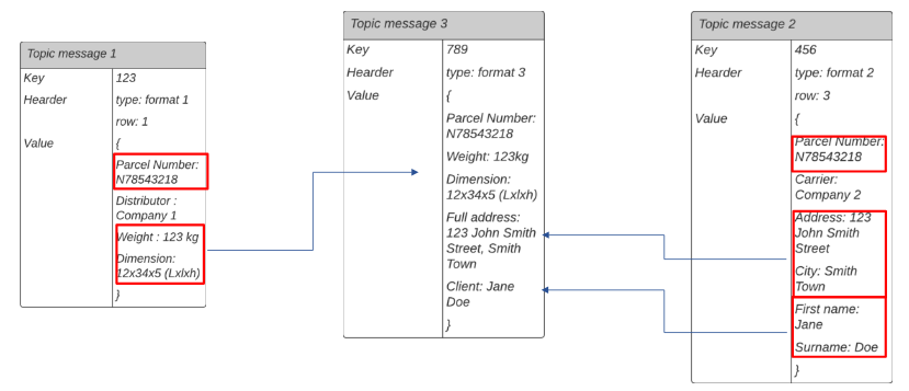
Message Mapping
One of the first tasks assigned to me was to perform message mapping. This involved retrieving a message in a given format and converting it into another format to send it to another component.
Example of message mapping
In this example, we initially have two messages, “Topic message 1” and “Topic message 2,” from which we want to extract information. This information will be used to create a new message, “Topic message 3.”
The two initial messages, “Topic message 1” and “Topic message 2,” are retrieved using the parcel number (“Parcel Number”) as a common identifier.
Once these messages are retrieved, the necessary information is extracted from each of them.
The extracted information is then combined to create the new message, “Topic message 3.”
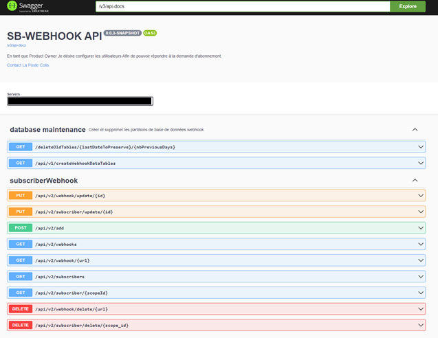
Adding Features with Swagger
I added features to the Swagger API, an open-source solution used for the development and documentation of REST APIs. Since our application is developed with Spring Boot, Swagger can be used to document the various routes, methods, parameters, and responses of the API.
The added features include:
Adding new “webhooks” and associated “subscribers.”
Deleting “webhooks” and “subscribers.”
Modifying and updating existing “webhooks” and “subscribers.”
The ability to view all “webhooks” and all “subscribers.”
The ability to view a specific “webhook” from an ID or URL, and the same for “subscribers.”
Implementation of Technical Replay
I also implemented technical replay, which involves resending messages that were not correctly sent due to server access issues or other problems that might occur. Additionally, it can be used as a testing tool to check for the existence of a bug.
Development of Tests
I developed a suite of unit and integration tests. Unit tests were conducted using JUnit and Mockito, ensuring that each individual component worked as expected. Integration tests were set up to validate the interaction between different modules of the system.
I carried out the deployment of various projects in the appropriate environments using the available deployment pipelines.
Skills Developed
With these contributions, I learned a lot and developed many skills. By working on user stories, I gained a deep understanding of how user needs translate into technical features. By working more on Spring Boot, I reinforced what I learned during my training and the implementations of the framework in a professional environment.